In the 1950s, 3D movies were all the craze. Since then, the technology has improved immensely and 3D has been used in a variety of interesting, educational and entertaining ways. For presentations, however, sometimes two dimensions are better than three.
In, Presentation Zen, Garr Reynolds applies a principle from the field of electronic communications – Signal-to-Noise Ratio (SNR) – to presentations:
[T]he SNR is the ratio of relevant to irrelevant elements or information in a slide or other display. The goal is to have the highest signal-to-noise ratio possible in your slides. … There is simply a limit to a person’s ability to process new information efficiently and effectively. Aiming for a higher SNR is an attempt to make things easier for people. Understanding can be hard enough with out the excessive and the nonessential bombardment by our visuals that are supposed to be playing a supportive role.
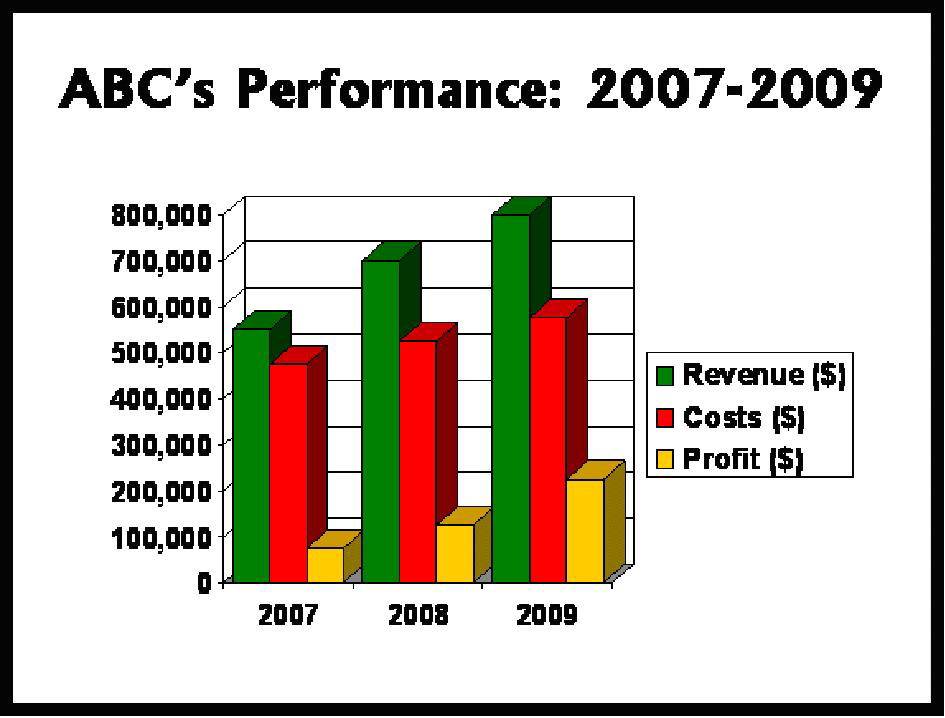
One good way to reduce the “noise” in your slide presentations is to use two-dimensional charts and graphs and forget about fancy 3D effects. 3D does not make the information for the audience easier to understand; to the contrary, it can often make it harder. Let’s look at a simple hypothetical example.
Below is a chart for the three-year performance of ABC Co. The 3D effects make it difficult to understand all of the numbers. For example, the yellow Profit column for 2008 is partially obscured by the green Revenue column for 2009. Did profit for 2008 come in at $100,000 or greater? Not so clear.
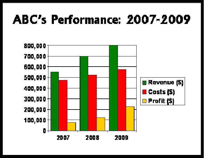
Now let’s look at the same figures in 2D. Less fancy, to be sure; however, it is also much clearer. Profit for 2008 did exceed $100,000. The information is much more digestible for the audience.
As Reynolds says:
While it’s nice to have a choice perhaps, 2D charts and graphs will almost always be a better solution. Three-dimensional charts appear less accurate and can be difficult to comprehend. The viewing angle of the 3D charts often makes it hard to see where data points sit on an axis. If you do use the 3D charts, avoid extreme perspectives.
Remember that the next time you are using charts or graphs. Save the 3D effects for another time. Perhaps a good IMAX movie.














6 Replies to “2D or Not 2D? That is the question.”
Yes! My favourite professional statistics software package – STATA – can’t even produce 3D charts. It’s a bit of a religious war, but you don’t really need them and they only distract the reader from the information content of the graphic. There are always other ways to present a 3rd dimension if one exists in the data.
While we’re at it – please don’t use pie charts for statistics that don’t add up to 100%. And please scale your axes from zero. And label your axes so that we can see the scale properly and whether you’re using a log scale or not.
William, thanks for the comments. And I agree with the points about pie charts and axes.
Hello John,
In the interest of clarity I never use 3D stacks or pies. The information should be as clear and simple as possible.
Daniel
With presentation design, in a sense the real ‘third dimension’ should be time. Most current presentations are more like those old zoetropes than they are like films – just a series of static images.
What film directors realise is that by using animation intelligently (i.e. time, an extra dimension) greater impact is possible than with static images. While a lot of people have moved beyond bullet points, they have only got as far as miniature ‘billboard’ design. When we get as far as TV information graphics, we’ve probably got to the right place…
Thanks John. This is such an important topic, and I’m amazed that programs like Excel and PowerPoint still let people use 3D charts!
Readers here might like what I wrote about presenting charts well (which you can sum up in 3 simple steps). It even includes a 1-minute video from a Microsoft Excel expert, who explains very clearly and convincingly why 3D charts are a bad idea.
Good point, Craig. Microsoft should remove the 3d capability!