A while back I wrote a post entitled “Look this way, please”. In it, I discussed how you can make the messages in your PowerPoint slides more effective by having people in the pictures “look” at the text.
I recently came across an interesting article by James Breeze, a business psychologist in Sydney, Australia, on the same topic. He has kindly agreed to let me reproduce it here for you.
James has used some pretty nifty eye tracking technology to determine where people look when shown slides containing lots of information. Not surprisingly, we look at people’s faces first and text second. What is interesting, however, is the amount of time we spend looking at the pictures and the text when (a) the picture is looking directly at us and (b) the picture is looking at the text.
———
You look where they look
by James Breeze
People look at other people’s faces.
In this video I showed that even my 11-month old son looks straight at faces shown to him in Facebook! It is habitual.
Did you know that the images of faces that capture people’s attention can be used to guide people around a website or an ad? I thought it was obvious! However, when I was at ad:tech Sydney 09 … I mentioned it to people, and they were amazed! I realised it was worth posting about it!
Here’s a little experiment with 106 people that I’ve demonstrated the Tobii T60 Eye Tracker to over the last month or so.
The image below is a sample gaze path of one person looking at a baby in a product ad:

The blobs are where the person has fixated on the image. You’ll notice the person starts looking in the middle of the page (we planned it that way by using a fixation cross between each stimuli) and then goes straight to the baby face. He focusses on it a few times then moves his attention over to the text by his 7th fixation.
And here’s an image of that same baby looking up and toward the main content heading. Notice the person fixates less on the baby’s face and then he quickly looks straight over to the text at the 5th fixation.

One person you say?
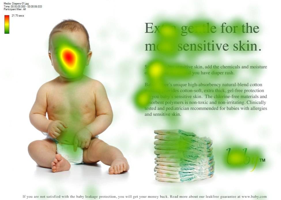
Well, here’s a combined heat map of 106 people looking at the first image. The redder the spot, the more time people looked at it.

There is heaps of focus on the baby’s face and relatively little on the text.
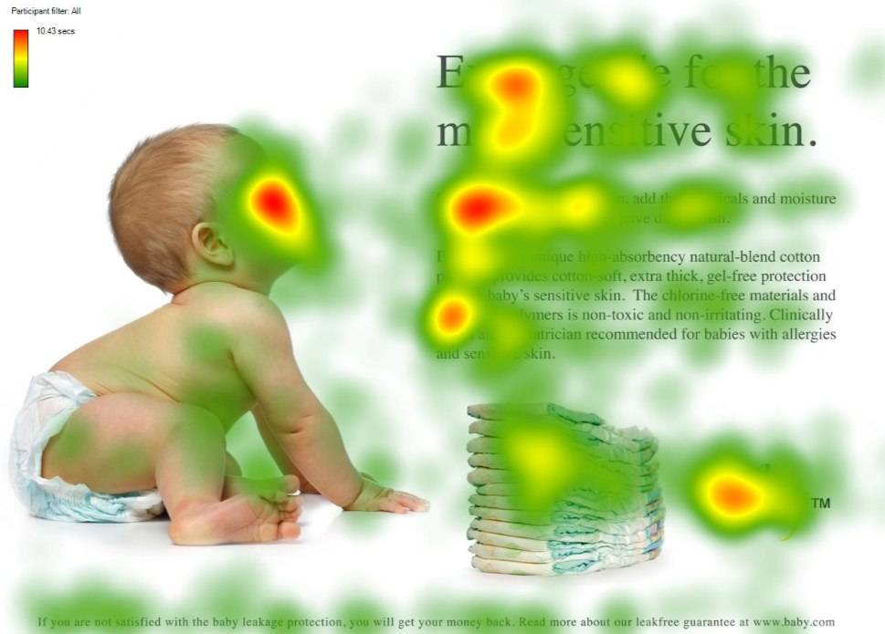
Here’s the same 106 people looking at the second image for the same amount of time. (The images were shown to everyone in a random order on Tobii Studio software running with a Tobii T60 eye tracker).

Notice how many more people read the text when the baby is looking at in the above image? Not to mention the increased attention on the brand!
In advertising we will look at what the person we see in an ad is looking at. If they are looking out at us we will simply look back at them and not really anywhere else. Faces can be used to guide a person’s attention to key content and make sure they actually read it.
What are you looking at?
———
The eye tracking technology is intriguing. And a reminder that with a little thought and effort, we can make our slides much more effective. We can have our audiences focus on what we want them to.
For those of you interested in learning more about the psychology of where we look, a great place to start is this article by Les Posen.


10 Replies to “What are you looking at?”
Thanks for sharing this fascinating insight, John. Most impressive and great to know!
Very useful post – and nice to have scientific proof of something that has often been conjectured!
There are other implications of this, however. The fact that most people focus their gaze on faces demonstrates how distracting using such pictures can be. I’m convinced that using a single big picture of a person on a slide will take up too much of an audience’s focus – would you agree?
Thanks, Lesa. Glad you found it useful.
Jessica, thanks for the comment and question. A big picture will certainly attract the audience’s attention, but that is not necessarily a bad thing. Provided that the picture reinforces the message that you want to get across, it can be a very powerful and positive tool. Perhaps an example would help.
If you look at my posts on telling stories you will see at the top a great picture of a beautiful little girl with a number of story books. I have used that picture in presentations as a lead-in to the module on how to use storytelling to make your message stick. When I put the slide up, I watch the audience’s reaction. There is almost always a wave of smiles. And I am fine with that because I know that the image has resonated with the audience.
I leave the slide up for a bit and then switch to others on the same topic. I give examples, cite some relevant statistics (which I wrap up in a story), entertain questions and eventrually move on to the next topic. Now, will everyone remember every single point that I made about the importance of storytelling? No. But I am pretty confident that most, if not all, of the people in the audience will remember the picture of that little girl, which in turn will reinforce the message that when we speak we should tell stories. And if they remember that, I will have done my job.
Of course, the picture needs to be relevant to the point that you are trying to make. And, it should be seen in the context of the entire presentation. Finally, never forget that the primary focus of any presentation is the speaker himself or herself. The slides are supporting material. That is why, whenever I want to make sure that the audience is 100% focused on me, I will turn the screen black to refocus their attention.
I hope that this (rather lengthy!) response helps.
John – you make a good point, and your example works well.
Perhaps the issue is not using photos entirely, but using them incorrectly? I have seen too many presentations in which a presenter uses just a big picture to ‘illustrate’ a point, and then leaves the image up while he continues to talk. The problem with this is that often the picture chosen doesn’t suggest to the audience the exact message he wishes to portray – the audience will be thinking about what that picture means to them, which could be something entirely different.
Thank you for the response. And yes, more presenters should know how to use the B key!
Looking good John!
Am preparing some more research with a university at the moment. May take a while but am excited to get it out there!
Great news, James. Best of luck with the research. I look forward to hearing the results as, I am sure, do many others. Cheers!
Very interesting John. I agree that it’s vital that the picture helps tell the story.
I blogged a month or so ago about *bad* PowerPoint and complained about the tendency for technology companies to put generic people staring into the middle distance into their presentation slides as a quick and cheap way to humanise their message.
Maybe I’ve just seen too much, but I always sit there thinking, who is that? Why are they there? What are they looking at? Do they think that network managers really look like that?
Great research – most interesting, I’ll incorporate it into my future presentations.
I usually introduce some form of music at the beginning, end or on changing slides – baroque/classical appears to work well – anyone else use the ‘sound’ features of PPT?
Hi Dear Breeze,
Hope all is well.
I would like to mention this baby diaper ad in my master’s thesis. Would like to recommend related articles or so? Thanks.
Thanks dear Zimmer, too 🙂