When it comes to slide presentations, I am a believer in good design, even though I am not a design specialist. Oh, I know a few things that you can do with software like PowerPoint and Keynote, but most of it is pretty basic. Good design is more than just flashy technology up on the screen; good design is about following some basic principles. Principles apply to many things that are far removed from the world of presentations and public speaking.
I often look for inspiration from people who work in professions about which I know little or nothing. Doing so gives me unique perspectives on issues and gets me thinking in different and creative ways about how to transfer a message. I have sought wisdom from people who have worked in a wide variety of fields, including the following:
- Dieter Rams – Industrial design
- Pablo Picasso – Art
- Alain de Botton – Philosophy
- Jan Taminiau – Fashion
- Steve Jobs – Computers
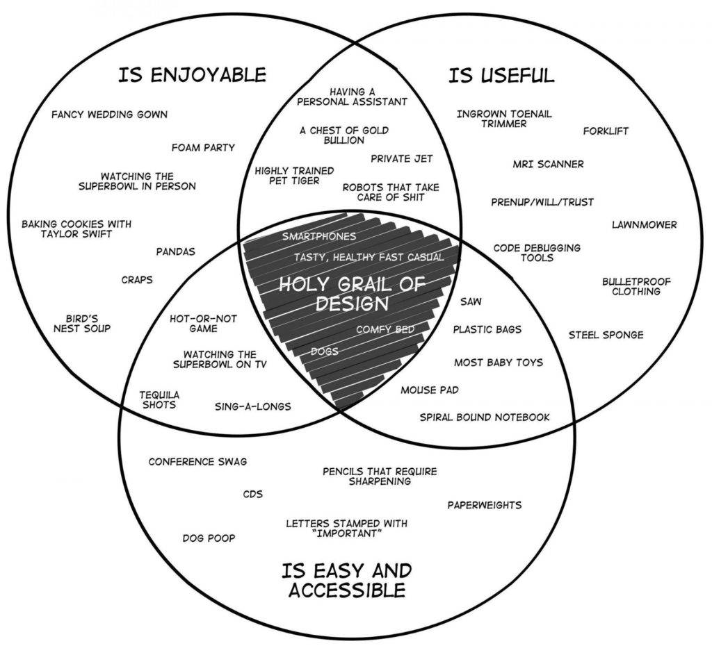
This morning, I read a post on Medium by Julie Zhuo. She is a Vice-President of product design at Facebook. The post contains three doodles from her sketchbook that capture some of her thoughts about design. The first one, in particular, caught my attention. It is entitled The Holy Grail of Good Design:

I like the Venn diagram: enjoyable; useful; easy and accessible. Of course, you might not agree with where Julie has placed some of the items. For example, I bet that this guy would argue that “pencils that require sharpening” are also enjoyable and useful. And, over time, items can change location. As technology improves, “robots that can take care of shit” will undoubtedly become easier and more accessible.
The point is to think of each of the three circles when you create your slides so that you can reach the “Holy Grail”:
- Are they clear and easy to understand?
- Are they enjoyable, with the right mix of text, images, graphs, videos, etc., or are they a godawful litany of bullet points?
- Can the audience learn something useful from them?
If you just keep these three ideas in mind for every presentation, your slides will be much better than most of the slides that are floating around out there.
For more on good design, here is a short post and video on how to design like Apple. Two great resources aimed specifically at the design of presentation slides are Presentation Zen and slide:ology.


6 Replies to “The Holy Grail of Good Design”
Thanks Craig and dammit, you’re right! The image is a Venn diagram, not concentric circles. Not sure what I was thinking when I wrote that. The error has been fixed.
Interesting post. Simple sketches like Venn or quadrant diagrams are great candidates for putting on a slide (provided the text is readable). They’re simple enough to discuss in a presentation setting, yet often provide a-ha moments to help grasp the topic.
BTW, they’re not concentric circles. Not sure what the “official” term would be, but I’d just call them “overlapping” or “intersecting”.
Thank you for a good comparison. Your advice helped me a lot.
I am glad that it helped.