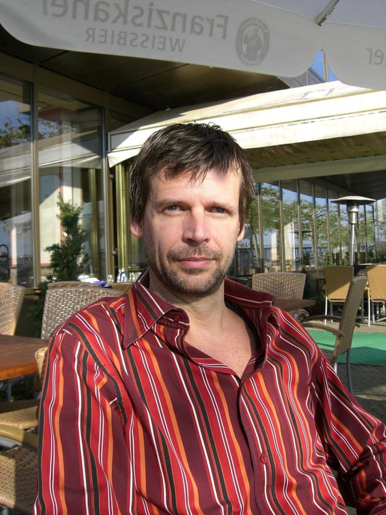
I am referring to Dick Hardt, founder and CEO of Sxip Identity and a big proponent of Identity 2.0. (Unless, of course, you actually do know Dick!)
The presentation below (which, as you’ll see, was the inspiration for the title of this post) is an old one. It is the 4 August 2005 Keynote Address that Hardt gave at the O’Reilly Open Source Convention in Portland, Oregon. I first saw the presentation years ago, but recently came across it again. It reminded me of a post that I wrote last year based on a “radical” idea from Seth Godin about using more, not fewer, slides in a presentation.
Hardt certainly take this idea … to heart. I lost count, but in this 15-talk, he easily uses several hundred slides. The result, however, is effective, especially judging by the numerous positive comments that were left on YouTube. Here’s the presentation:
Some thoughts on Dick Hardt’s presentation:
- On the whole, the slides supported the talk well.
- I appreciated that almost every slide contained minimal information, allowing me to easily grasp the main idea.
- Alternating between visuals and key words was effective.
- Hardt could have dispensed with some of the slides that just had text. Many of the text slides were effective; others he could have omitted to allow for more direct interaction with the audience.
- Speaking of interaction, it is difficult to know for sure just how much Hardt did interact with his audience because, for the most part, the video focuses on the slides. However, we get an important clue from 6:08 to 6:17 when the camera focuses on him. Two things leap to mind: (a) he spent much of that time talking to the computer; and (b) he was “chained” to the computer because he was not using a remote control to change the slides.
- A remote would have allowed Hardt to move about the stage and thus interact more with the audience.
- There is a risk that comes with using so many slides. Unless you have an incredible memory, you will have to check the screen repeatedly to ensure that you do not get lost. Setting up a large computer screen at the foot of the speaking area facing the speaker can help. This will allow the speaker to check the slides quickly without having to turn away from the audience.
- I liked the repetition of certain slides to reinforce key ideas and themes. Repetition of the slides also allowed Hardt to have some rapid slide changes which I found effective.
- I appreciated the way in which he injected some humour into his slides.
- Hardt’s voice projection and pronunciation were good. I do feel that there were times when he could have paused more between key ideas to let the audience keep up.
Of course, there is no magical number of slides that is right for every presentation. It depends on the material, it depends on the amount of time available and it depends on the effect that you want to create. However, Dick Hardt’s presentation, dated though it is, serves as a useful reminder that it is not so much the number of slides that is important; rather, it is how you design them and how you use them.


