Presentation design hacks; they’re not that difficult and they make a big difference when it comes to effective PowerPoint or Keynote slides. Why settle for bland and boring slides that are filled with bullet points when you can do so much more? And the good news is that you don’t have to be a tech wizard to create good slides for your presentation.
By keeping your slides simple and visual, and by applying common sense, you can make your slides stand out from the crowd. A good rule of thumb is to think of your slides like the signposts along the side of the highway.
When you are driving along at 120 km per hour (or more in some countries) and you are approaching a signpost to indicate distances to cities, upcoming off-ramps, etc., you only have few seconds to absorb the information. Your slides should be the same for your audience. In other words, they should be able to grasp quickly the point of the slide and then return their focus to you.
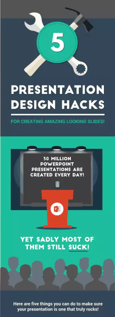
Adam Noar, founder of the firm Presentation Panda, recently sent me the infographic below. It offers five simple, but effective, presentation design hacks that you can use to improve the quality of your slide presentations.
I have been using the first two hacks—Unsplash and Font Squirrel—for a long time. I look forward to checking out the other three. Thanks, Adam.


3 Replies to “5 Presentation Design Hacks”
Thanks for sharing, John. It looks like Unsplash could be extremely useful, and I’ve already downloaded some gorgeous shots.
I’d like to add a strong caution to the 2nd tip though (about downloading fonts).
If you present your slides on another computer, or upload them to a tool like Adobe Connect, it’s almost certain that the downloaded font will be automatically replaced. So in such cases, it’s highly likely that your slides will look a complete shambles – or even be unreadable.
For more details (and to see a 40-second video of that happening live at a conference!), please see this post.
Hi Craig. Glad you like Unsplash. They have some great stuff there. And thanks for the cautionary note about fonts. You are correct that if you have to run your slides on another computer, the slides will not come out the way you hoped. At best the font will change but at worst, it will be a mess. This used to be a bigger issue in the past when it was normal for people to show up with their presentation on a USB. Nowadays, most people will use their own computer – I always do – and so the problem is not as big. Nonetheless, it is good to raise a cautionary red flag.