The “eyes” have it.
Perhaps you have noticed that the tag line for this blog is a quote from Ralph Waldo Emerson: “All the great speakers were bad speakers at first.” Great quote. (And perfect for a blog about public speaking.) Here’s a slide of the quote and a picture of Emerson that I have used in courses that I have taught on public speaking and presentation skills:
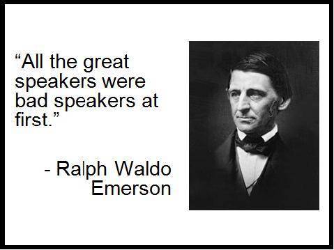
Question: Would the slide be as effective if Emerson’s picture were flipped the other way as in the slide below?
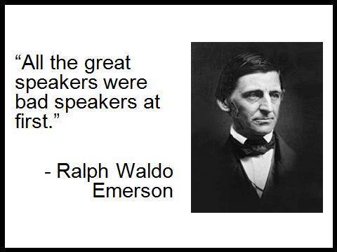
Most people (and most of my clients) prefer the first slide. Why? Because Emerson is “looking” at the words. In the second slide, he is looking away from them.
Psychologists have found that most people have their vision “pulled” in the same direction as that in which the person in the picture is looking. Yet we also want to read the words; thus when they are on the other side, we are simultaneously pulled in the opposite direction.
Another example; this one a little more nuanced. Have a look at the two slides below. Do you have a preference for one over the other?
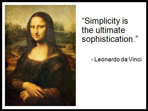
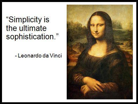
Some of the people in my classes had no opinion; however the majority preferred the first one. In the first slide, the Mona Lisa has her face turned away from the words. However, her eyes are looking at them. In the second slide, the reverse is true.
This makes sense. Have you ever spoken with someone who is facing you but whose eyes at one point look elsewhere? You will almost certainly turn and look in the same direction to see what is there.
Admittedly, today’s tip is a subtle one and most people would not have difficulty with any of the slides above. However, as speakers our job is to make it as easy as possible for our audiences to understand and remember our message. Thus, everything that we can do to add a little more “spit and polish” to our presentations tilts the balance in our favour.
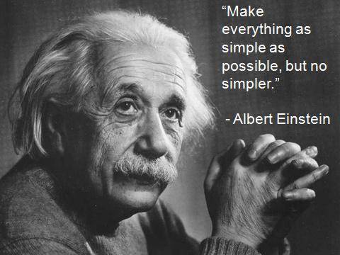
The next time you combine pictures of people and words on a slide, make them work as effectively as possible by having the people look at the words. And be creative. You do not have to limit yourself to pictures of people looking directly left or right. With a bit of thought, all kinds of pictures can be used.
Just ask Albert Einstein, someone who did his fair share of thinking.


16 Replies to “Look this way, please”
This is fascinating. With the Mona Lisa slide – it really is all about the eyes. You are absolutely right. These slides also reinforce the power of eye contact in general. We like to see the eyes facing the text because it makes us think that the body language and words are congruent. Somehow the eyes also reinforce the content. I just wrote about the power of eye contact: http://sarahgershman.blogspot.com/2009/11/power-of-face-to-face-encounter.html.
Thank you for this post!
Sarah
I am the complete opposite.
For the Emerson slide I prefer slide two simply because he is looking away from the words. This makes more sense to me. Words in a slide are there to communicate the message not be the message.
For the Mona Lisa I see no difference. They are both neutral and equally effective.
It could be that I am left-handed so I have a different perspective.
Its rather strange when you say that ”all of your students agree with you” – might it not be a case that some of your students don’t want to offend by disagreeing with you or feel compelled to agree.
Myles,
Thanks for the comment. Always good to have a different perspective. It is interesting about your left-handedness, although I have no basis to know whether that makes a difference to your preference.
I do take issue with the last paragraph of your message. You misquote me. I never said that my students agree or disagree with me. I said that they preferred the first slide. The issue was one of preference, not agreement. Besides, I began the discussion by simply showing them the two slides and asking which one they preferred without telling them my preference or the rationale for structuring one’s slides the way I discuss in the article.
If you want to read more from the psychological perspective, check out the great article by Les Posen, who refers to my post but goes into much more detail: http://lesposen.wordpress.com/.
John
Great point – particularly about Lisa’s eyes!
The next thing to consider is losing the inverted commas around the quote. By taking the inverted commas away, the quote becomes a fact associated with the picture, rather than a quote using the picture.
Simple, but effective.
Cheers
Daarren Fleming
Australia’s Corporate speech Coach
Einstin made a very large contribution to the world, especially in the field of physics. Although he was a very clever man, he’s still human, and certainly made mistakes.
@Daaren You commented that leaving out the quotation marks means “the quote becomes a fact associated with the picture, rather than a quote using the picture.”
If I read this correctly it sounds like you’re saying the picture is the important element with the words secondary yet supportive, while the other way is for the picture to be secondary to the words.
Is this correct? And you also say it’s effective… how do you measure this? Gven that in each slide we see a recognisable face, and the name under the quote matches, is it possible that as long as you’re consistent it makes little measurable difference. In some respects, by offering the name underneath the quote, the quotation marks become redundant, and perhaps take away from the clean and lean look I personally prefer and use. Sometimes having the quote in italics and the source in regular font can perform the same function.
As an aside, the only time I ever read the words on a slide, is when I’m reading a quote and don’t want to get it wrong; even then I’ll try and alter my voice to somehow match how I think the author might sound, i.e, it’s not my quote, it’s theirs.
Interesting insight. I give lots of presentations to classes, so I appreciate you pointing this out. What is your suggestion when the person in the photograph is looking straight ahead?
Thanks for sharing!
Thanks for the comment, Catherine. When a person is looking straight ahead, you have more flexibility in terms of where you place the text. But be careful! A photograph looking straight ahead might not be the best choice. See my follow-up post on this topic: http://wp.me/pwfa1-tj
Cheers!
Brilliant! That’s all I have to say!!
Thank you! That’s all I have to say!
Hi John. I’ve linked to this post from my own upcoming blog post, but I noticed the pictures don’t appear here any more. Somewhere on your site, do you still have the JPG files you used, by any chance?
Hi Craig. Thanks for the head’s up. I am not sure what happened. The images were all there in the media file. Since upgrading to the WP business plan, the site has been a bit wonky on a few things. But the images are back now.