Quotes for Public Speakers (No. 246) – Garr Reynolds

“Humans are completely incapable of reading and comprehending text on a screen and listening to a speaker at the same time. Therefore, lots of text (almost any text!), and long, complete sentences are bad, Bad, BAD.” Garr Reynolds
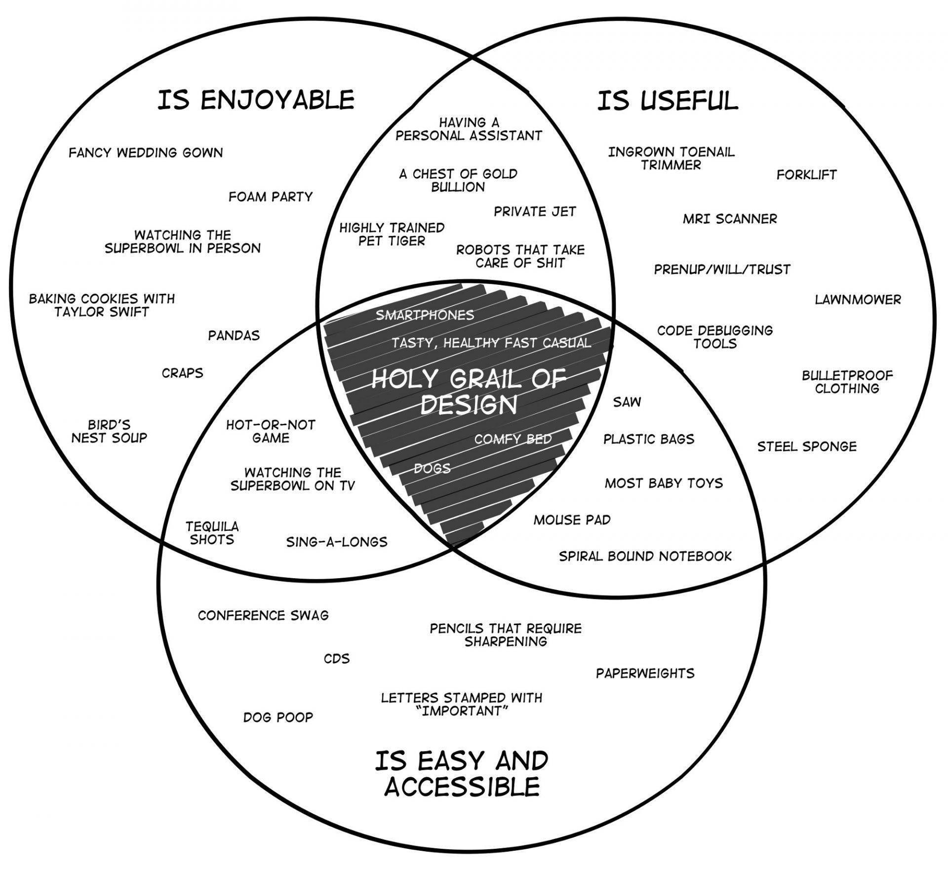
The Holy Grail of Good Design

When it comes to slide presentations, I am a believer in good design, even though I am not a design specialist. Oh, I know a few things that you can do with software like PowerPoint and Keynote, but most of it is pretty basic. Good design is more than just flashy technology up on the screen; […]
Quotes for Public Speakers (No. 81) – Garr Reynolds

“Professional entertainers know that you want to end on a high note and leave the audience yearning for just a bit more from you. We want to leave our audiences satisfied (motivated, inspired, more knowledgeable, etc.), but not feeling that they could have done with just a little less. “We can apply this spirit to […]
A public speaking fable

This post is an adaptation of a story about a fishmonger that Garr Reynolds recounts in his book Presentation Zen. Reynolds heard the story from a man who recalled it from his childhood while listening to Reynolds speak about the need to reduce the text on slide presentations to what is essential. The Tale of […]
Five Tips for Writing (and Speaking)

Five tips from author Kate Mosse about writing a novel that are also useful for improving your public speaking and presentation skills.
2D or Not 2D? That is the question.

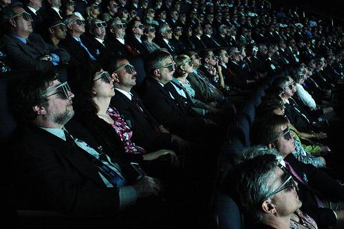
When presenting charts or graphs, always use two-dimensional ones and not three-dimensional ones. This post explains why.
Tagged 3D effectsGarr ReynoldsgraphsIMAXpresentation skills trainingPresentation ZenSignal-to-Noise RatioSlide Presentation


