Quotes for Public Speakers (No. 342) – Steve Jobs

“I hate the way people use slide presentations instead of thinking. People confront problems by creating presentations. I want them to engage, to hash things out at the table, rather than show a bunch of slides. People who know what they’re talking about don’t need PowerPoint.” Steve Jobs Photo courtesy of Ben Stanfield
5 tips to save your batteries (and your presentation)

Slide presentations are a staple of the business world. Every day, there are millions of PowerPoint, Keynote other slide presentations around the world. By some counts, the figure is 30 million each day! If you are going to use to a slide presentation, use a remote to advance your slides. I discuss the reasons why, […]
5 Presentation Design Hacks

Presentation design hacks; they’re not that difficult and they make a big difference when it comes to effective PowerPoint or Keynote slides. Why settle for bland and boring slides that are filled with bullet points when you can do so much more? And the good news is that you don’t have to be a tech […]
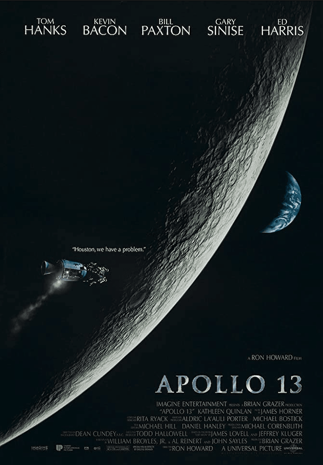
When Things Go Wrong: Ten Presentation Lessons from Apollo 13

Every public speaker can learn a lesson from Apollo 13. The day of the big presentation has arrived. You’ve prepared, you know your material and you’ve arrived at the venue early to get set up. You check the room and everything looks fine. The stage is ready, the sound system works and the lighting is […]
The Atomic Method of Creating a PowerPoint Presentation

Seth Godin is the author of several books about “marketing, the spread of ideas and managing both customers and employees with respect”. They are bestsellers. His blog is one of my favourites and I highly recommend it. This post is part of a series based on original posts by Seth. In this blog post from 13 October 2011, Seth […]
Ten Commandments for Writing and Speaking

I spent some time yesterday going through a box of old papers, filing some and recycling the rest. As I worked my way through the documents, I discovered an old photocopy entitled “Ten Commandments for Plain Language Documents”. It came from the Canadian Bar Association and is dated October 1990. There’s a lot of wisdom in […]
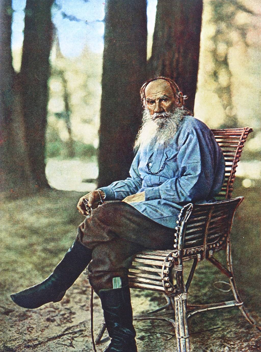
A Lesson From Leo Tolstoy

A valuable lesson for public speakers from Leo Tolstoy’s classic story, “How Much Land Does a Man Need?”.
Making Data Meaningful

A brilliant four-and-a-half minute slide presentation that demonstrates how statistics and data can be conveyed so that they have an emotional impact on the audience.
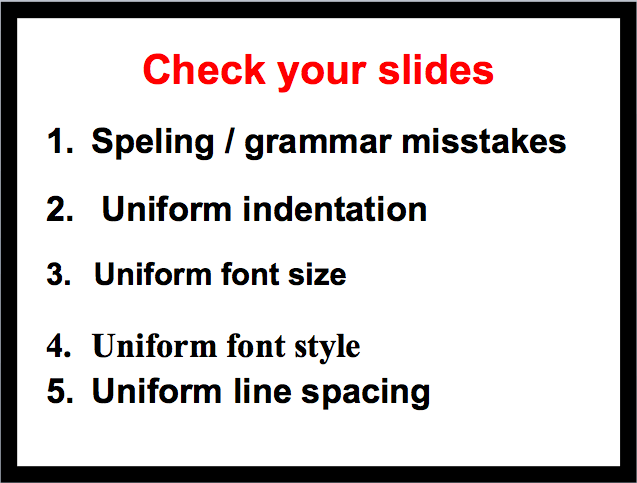
Five Typographical Errors to Avoid on Your Slides

Five typographical errors to avoid on your slides: (1) spelling and grammar; (2) indentation; (3) font size; (4) font style; and (5) line spacing.
Tagged FontGarr ReynoldsPresentationpresentationsProofreadingSlide Presentation


