Quotes for Public Speakers (No. 246) – Garr Reynolds

“Humans are completely incapable of reading and comprehending text on a screen and listening to a speaker at the same time. Therefore, lots of text (almost any text!), and long, complete sentences are bad, Bad, BAD.” Garr Reynolds
50 New Year's Resolutions for Public Speakers

Here are 50 New Year’s Resolutions to help you take your public speaking to a new level in the New Year. In no particular order: 1. I will prepare. 2. I will practice. 3. I will have a clear message. 4. I will be able to distill every speech and every presentation into a single sentence. 5. […]
Quotes for Public Speakers (No. 81) – Garr Reynolds

“Professional entertainers know that you want to end on a high note and leave the audience yearning for just a bit more from you. We want to leave our audiences satisfied (motivated, inspired, more knowledgeable, etc.), but not feeling that they could have done with just a little less. “We can apply this spirit to […]
Five Typographical Errors to Avoid on Your Slides

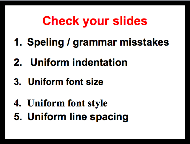
Five typographical errors to avoid on your slides: (1) spelling and grammar; (2) indentation; (3) font size; (4) font style; and (5) line spacing.
A public speaking fable

This post is an adaptation of a story about a fishmonger that Garr Reynolds recounts in his book Presentation Zen. Reynolds heard the story from a man who recalled it from his childhood while listening to Reynolds speak about the need to reduce the text on slide presentations to what is essential. The Tale of […]
On top! (Well, sort of)

Actually, I am at the bottom of the top, but couldn’t be more pleased. That’s because as of today, this blog is on Alltop, the “online magazine rack” developed by Guy Kawasaki and his colleagues. Basically, the folks at Alltop collect the headlines of the latest stories from what they consider to be the best […]
2D or Not 2D? That is the question.

When presenting charts or graphs, always use two-dimensional ones and not three-dimensional ones. This post explains why.
Tagged 3D effectsGarr ReynoldsgraphsIMAXpresentation skills trainingPresentation ZenSignal-to-Noise RatioSlide Presentation


